iTunes Browser Concept
I’m a pretty heavy iTunes user. And with my music collection, the “browser” is the quickest way for me to browse and navigate to the music I’m looking for. But the browser doesn’t always use space efficiently, and it doesn’t display album artwork. By comparison, the iPod and iPhone provide rich navigation in a single column and display album art in list views. So I made the video above to show how iTunes could benefit from a similar interface. I think even light iTunes users could benefit from this because it makes browsing iTunes much more like browsing the iPod. I hope you enjoy it, I recommend watching it at full screen or in HD.
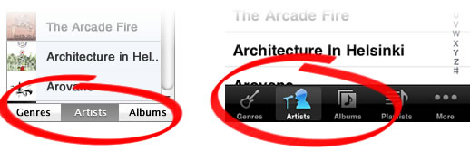
Some viewers may have noticed three little buttons at the bottom for “Artist, Genres, Albums.” These buttons work just like the buttons on the bottom of the iPod app on the iPhone; they enable the user to choose the top level hierarchy of navigation. So with “Genres” selected the user would browse by Genre > Artist > Album. And with “Album” selected it would just be a list of albums organized alphabetically with no sub navigation.
The intention with all this was to mock-up an interface that provides all the rich functionality of the full 3-column browser in just one column, incorporate album artwork into the browser to make it more graphical and help people recognize their music more easily, and lastly make a more cohesive experience of browsing music on iTunes and iPod. I’d love to see an interface like this in a future release of iTunes in addition to the standard multi-column browser that can be positioned at the top or left of the iTunes app.
I had to turn comments off on my blog because I was getting an absurd amount of comments from spammers. So if you have a question or comment about all this feel free to write me at getgreg at theyshoulddothat.com. I’ll do my best to respond, but I’m pretty busy with classes right now…